Showing posts with label embossing resist. Show all posts

Sunday, 11 September 2016

Autumn Colours

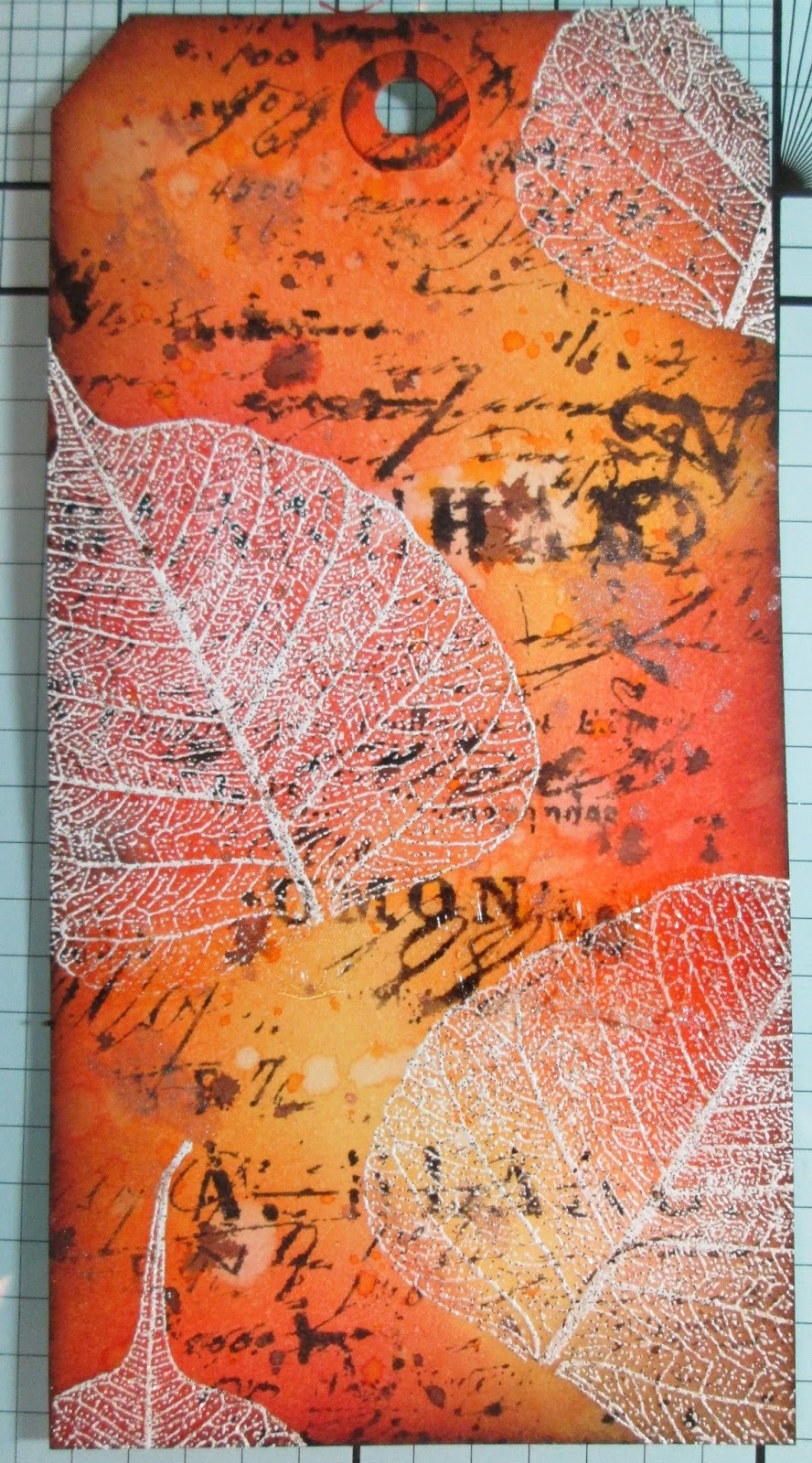
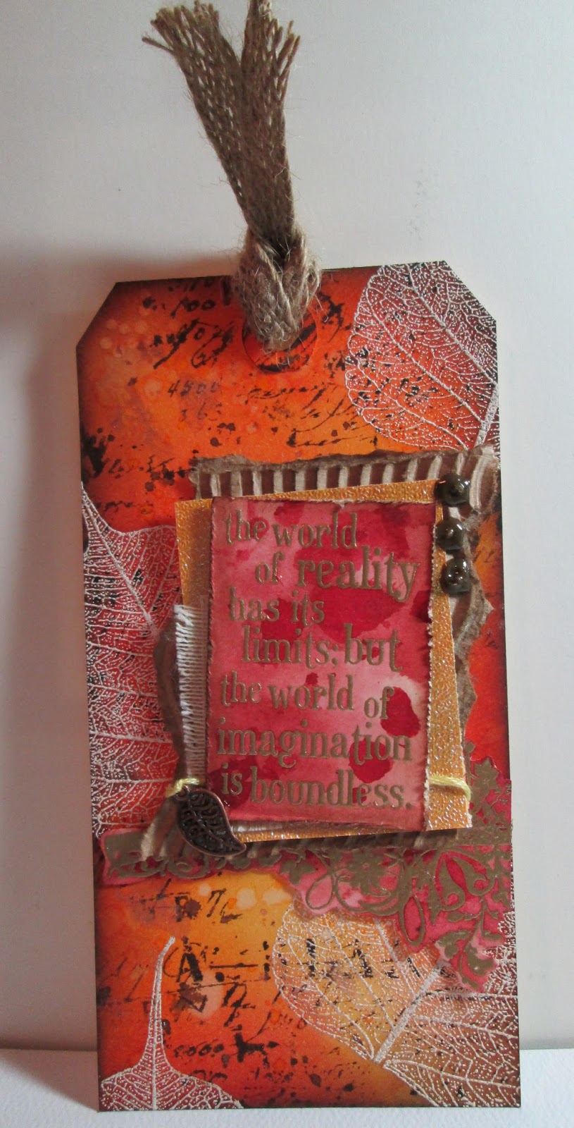
Well it's approaching Autumn here on the UK, although they keep talking about a heatwave still. It was my turn to choose the theme over at Fashionable stamping challenge this month and I went for a colour theme - Autumn colours. I made a tag -

I enjoyed last months resist technique so much I used it again - after stamping and embossing this beautiful skeleton leaf I used Distress inks to colour, splattered with water and stamped over with the script stamp from Tim Holtz Papillon set.  
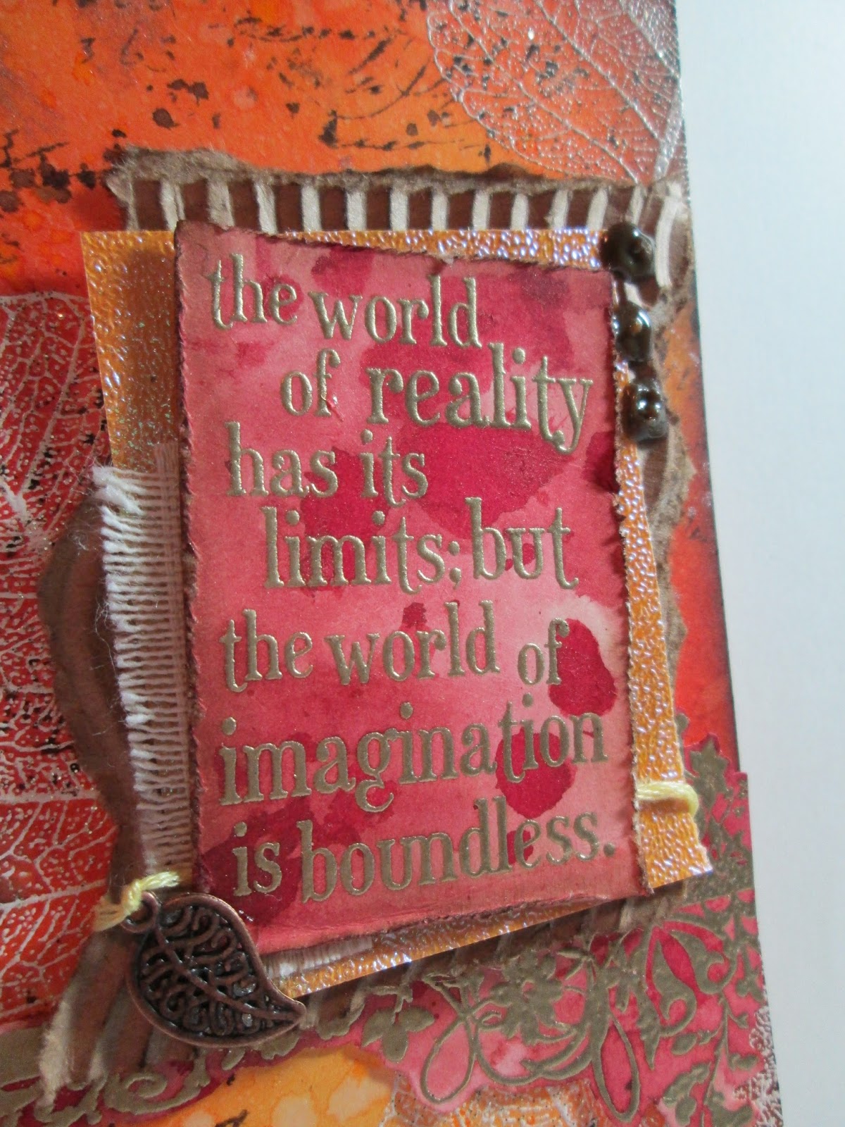
I stamped and embossed the quote and flourish onto card coloured with distress inks, then layered with corrugated card, canvas and shimmery paper. 
Don't forget we are a stamping challenge so we do need to see rubber/acrylic stamping on your project. To qualify for the winner’s prize we especially need to see that the stamping is the focal point on the project and that the stamping follows the format of the theme.

NO DIGI STAMPS ARE ALLOWED …but you may use digi downloads for enhancement of your projects … please remember that the main focal point must be STAMPING.

The winner of each challenge will receive a very generous voucher of $20 for Flonz’s Store.

I really hope you have time to join us....Happy Crafting..Esther xx

Sunday, 22 March 2015

Grateful / hopeful Journal Page

I'm trying to use my art journalling to help my stress and negative thinking so this page is all about hope and gratitude. It's based on the lessons learnt during this months Journal Journey and also inspired by IndigoBlu's challenge theme 'off the edge''. All the stamps I've used are from IndigoBlu. 
The Journal Journey lessons were about inclusions and dye inks and the theme for March was nature. I sprayed a layer of the palest ink spray, then stamped and embossed the flowers to create a resist before adding darker shades on top and Distress ink on the edges - I also created a smaller panel which would become my inclusion. I stamped the grasses across the bottom in Stormy sky DI and round the top with the edge of 'Ella Bella'.  
I created a little pocket on the inside of my inclusion and tucked in a tag with my journalling on.
 I stamped the other side of the smaller panel with the sentiment and 'Ella Bella' (off the edge), heat embossed in violet pearl EP before splattering with ink and using Distress ink on the edges - I had to remember to leave a border along the right which became a folded flap tucked underneath to secure it to the main page. 
I decided it needed more detail/layers so after adding strips of tissue tape I used grunge paste through a script stencil in the corners.

I'm also sharing my journal page here -

Thanks for stopping by - Happy Crafting - Esther xx
  

Sunday, 7 October 2012

Autumn’s here

Wow – where did those two weeks go? I've been off on my hols to Turkey (which was amazing) and it’s already time for another challenge over at Fashionable Stamping. Having just spent a week in glorious  sunny temperatures we returned to the UK to find Autumn well and truly on it’s way and over at FSC Paula has set the theme 'Shades of Autumn/Fall'. 


I have used a skeleton leaf stamp from The Stamp Man, in distress inks over the base card. For the next layer I’ve embossed the leaf in clear, then coloured over with DI.
Esther16
For the final layer I've used metallic leaf sheets on the skeleton leaf image which I first stamped onto brown card (though it looks black on the pic). I love this technique but it is REALLY messy – I'm going out with friends tonight and will have extra sparkle on my face and clothes I’m sure !
Esther15
I coloured a small panel with ink sprays and embossed the words with aged ivory Embossing powder. The Stamped butterfly is coloured with pencils and has a layer of glossy accents over it. 
I hope the wonderful rich colours of autumn inspire you to join us, and as always there is some wonderful inspiration over on the FSC site  – Please remember we are a Stamping Challenge so NO DIGIS and we must see some stamping on your piece.

I’m also sharing this here -
Vintage elusions – Wings
The Stamp Man - Butterflies, Birds, bees

I look forward to viewing your lovely creations....Esther xx

Monday, 30 April 2012

Emboss It Challenge

Hi all - it's my turn to choose the theme over at The Craft Room Challenge so I have gone for one of my favourite techniques. After basic stamping it's the first thing I learnt to do and I love the texture that Embossing techniques add to a creation whether it be as a background or focal element, I especially enjoy triple embossing  though usually make quite a mess doing it ! I've used embossing resist (fern leaves) and triple embossing on my sample – the sentiment is stamped on card and I have embossed over the top with 3 layers of clear EP, using a small flower stamp to make an impression before the powder cools and sets.
SD533023 As well as being on the Craft-Room Team I also design for Stamp Addicts and they have kindly agreed to Sponsor our challenge this week with a £10 voucher to be spent at their online shopAll the stamps used in my sample are from Stamp Addicts.

Established in 1992 Stamp Addicts is the UK distributor of top quality rubber stamp manufacturers JudiKins, DeNami Design and Printworks Collection.  Since 2009 Stamp Addicts have been manufacturing their own rubber stamps in unmounted sets, with new designs available each month and some soon to be available on static cling.  Stamp Addicts is also a stockist of Hot Off The Press templates and paper packs as well as lots of Tim Holtz Distress products.  They are also regulars on Create and Craft TV and have a new show scheduled on May 10th @12.00. 
So pop on over to the Craft-Room Challenge to see the inspiration from my fellow team mates, and join us with lots of creative embossing techniques! Have fun…Esther xx

Sunday, 14 August 2011

Time for a break..

Ooh how lovely I’ve got the week off work this week and am looking forward to some crafting time with my mum who’s popping over tomorrow to make a start on Christmas Cards! I usually never start these till at least October, but having had to make some DT samples for Stamp Addicts, I’m kind of in the mood now so will make the most of it and carry on. Here’s one I made with one of their latest  stamps releases  -SD532573
I’ve embossed the tree in clear to act as a resist before colouring the background with Distress Inks and spritzing with water. The pears are embossed in Gold, and I’ve added dots round the edge and on the base card. A glittery Partridge, pretty, (if wonky) ribbon and shrink plastic greeting finishes off.
I’m sharing this here -
Ribbon Girl – Use Ribbon
Secret Crafter – Christmas is Coming
Simon Says Stamp and Show – Tim Holtz technique
Stampin for the Weekend – spots and dots
Totally Papercraft – Food and Drink (stretching it a bit but Pears are food after all!)

Thanks for stopping by - Esther  xx

Monday, 16 May 2011

Mum's Birthday

Last weekend was my mum's 65th Birthday and we spent Sunday with her, my Dad and Brother.  My Brother lives in Belgium so it's not often we're all together as a family and it was a lovely day..and now mum's had her big day I can share the card I made for her with you - It's an 8"x8", I haven't tried making many of this size as it's a bit daunting but I like how this turned out...
Mum and I had a day together a few weeks ago crafting at my house and I was able to find out which was her favourate stamp of mine, she's not into frills and fuss so I went for elegant, using the colours of her living room (purple and grey - she likes things to co-ordinate!). I stamped the image (Printworks Stamp) in white and used pearl embossing powder, coloured with distress inks (dusty concorde and shabby shutters), masked the flowers and stamped text in Pumice Stone DI before layering on some lime then purple card. I used the negative from a die cut (TH elegant flourish) as a stencil and more Pumice Stone DI and then added the message on a die cut fancy label.
I have to say I really love this stamp too and it's well used. The colours of this card happen to be this weeks challenge colours at The Play Date Cafe - ok so I may of  added the lime green to my mums living room colours to make it so - but it is one of my favourate colour combinations. The Pumic stone looks quite brown on the photo and was more grey in RL..it's a great colour I find that takes on different tones depending on what I use it with, - or maybe that's my imagination! Anyway, as well as The Play Date Cafe, I'm entering this at Papertake weekly (Punches) and Stamp Something (Anything Goes).  Thanks for looking and hope you're having a good week...Esther xx

Sunday, 20 March 2011

Rock Chick Birthday


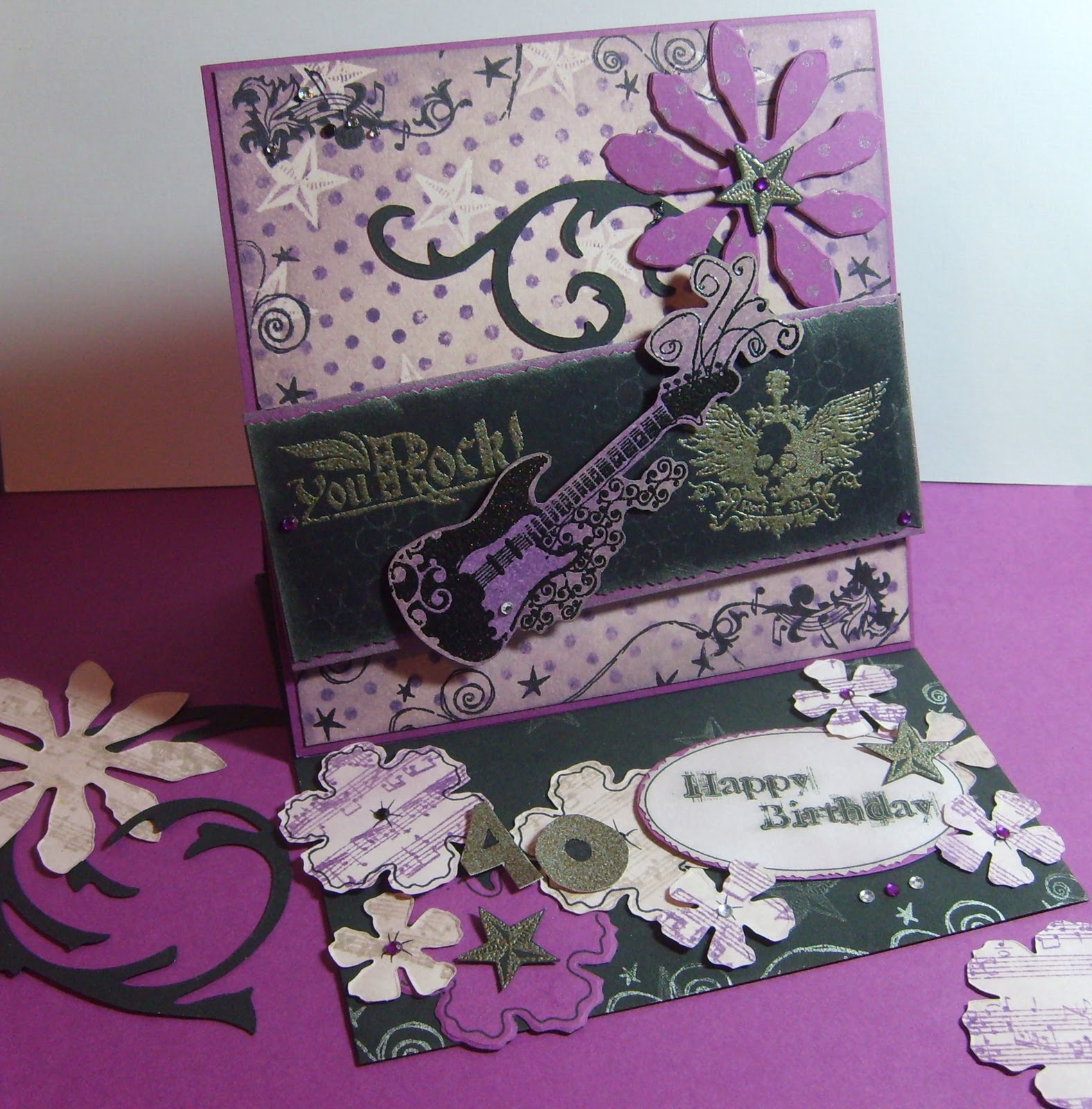
This year seems to be one of big birthdays- My mum is 65 in a couple of months and myself, my other half and my best friend are all hitting 40! I'm the youngest of the three of us - my friend and partner are both 'celebrating' this week (spooky my other half and best friend of 25yrs were born in the same week!). Needless to say my weekend has been focused on creating cards for them and this is the one I've made my friend. She's a bit of a rock chick and so I've used a recently purchased (from E-Bay, is anyone else addicted?) set of stamps from Inkadinkadoo and my fav distress inks in milled Lavender, Dusty Concorde and Pumice Stone.  I coloured with Milled Lavender first, then clear embossed the stars to create a resist before adding the other colours and stamping with Hero Arts dots.  My trusty Tattered Florals die provided the feminine touch and a computer generated message finished off.
The guitar is embossed with black glitter EP - (you can see it if you click to enlarge the pic), and for the other images I've used Opaque Pewter by Stamp 'N' Stuff which is a gogeous EP for distressed looks but one I tend to forget about.  I made this card purely based on what my friend would like but it does happen to fit a couple of challenges by coincidence so I thought why not...over it goes to -


Now I must dive over to Facebook to remove the Network Blogs post before my friend sees this!! And I better think about what I'm going to make for the Other Half - not so easy...Men are so difficult (and tricky to make cards for too!!)
Thanks for visiting - Enjoy what's left of the weekend....Esther xx

Sunday, 7 November 2010

More ATC's - this could be addictive!

 Today I have had a fabulous time creating my ATC's for the next Stamp Man swap - which this month is 'Take a Letter'. I'm really enjoying taking part  and had some lovely swaps drop through the letter box, I'd never made ATC's before 2 months ago and can see it being very addictive. I have literally taken the A T C letters -

I've used a letter on each one so that they are linked as a set but also stand alone individually because I've used a theme connected to the individual letter  (does that make sense - it's getting late?). The colours were inspired by The Play Date Cafe challenge #54 which are gorgeous as always. Each background was made the same way, stamping and embossing an image in clear then using distress inks on a craft mat, spritzed with water and  'smooshed' on to the ATC. The clear EP resists the DI leaving a white image. I made each letter using the technique from Tim Holtz's compendium that Linda has chosen for this weeks challenge over at Studio L3 - it's page 54 and that's all I can tell you.  Not sure I'm really happy with how the letters came out, I didn't have the right tools so had to improvise and not sure it worked like it should - not 'scratchy' enough!.  I used shrink plastic to make wings for the A and a tiny clock for T. I had real fun with these just making it up as I went along with my stash of E-bay BargainTim Holtz stamps.
I'm also going to enter these into the Simon Says Stamp and Show challenge - Shabby. I must admit I get a little confused by the different styles sometimes because they seem to overlap - where does grunge stop and shabby start ? Anyway - my ATC's are Tim Holtz inspired which is what this challenge site is all about so hopefully I'm not too far out. Here they individually -

A - Artist
T-Time

C - Creativity
Thanks for having a look - better get to bed or I'll be no good for anything tomorrow and there's a list of commissioned Christmas cards waiting !!  Esther xx 

Saturday, 9 October 2010

Good to be back...

Hi - well we returned from our hols after a glorious week of relaxation, sunshine and cocktails - and although I missed WOYWW here's a pic of what was on my table on Wednesday!
But it's back to reality now which means back to my craft room. Although I loved my holiday it was exciting coming home as waiting for me were my swaps from 'The Stamp Man' ATC swap, which were lovely, (thanks to Meggymay, Crafty Meg and Pam Atkinson) and I gained a couple of followers while I was away so Hello to you. Also waiting for me were some Tim Holtz stamps which had arrived the day before we left and I had not had a chance to play with. I've never been able to justify spending out on these stamps because there's always some in a set that I didn't think I'd get use out of and they are a bit pricey - but I was soooo chuffed to get a real E-Bay auction bargain and ended up with seven sets for about the price of two (and that included postage from the states!!)...oh and I love them.

The first thing I did was make my ATC's for this months Stamp Man ATC swap. The theme is 'travel' so the stamps were perfect and I combined them with the 'wrinkle free distress' technique on P33 of Tim's compendium of Curiosities book which just happens to be the one Linda has chosen for this weeks challenge over at Studio L3 - funny that.   
Here they are with just the backgrounds done.
And here are the finished ATCs - the stamps are all TH except for the Antique Map I've used on the two at the top which is from The Stamp Man, and the 'Are we there yet?' phrase  (not sure where that's from). The Bon Voyage phrase is a sticker I've had hanging around for ages.
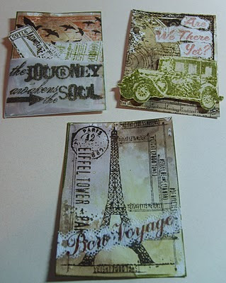
I've stuck with neutral colours plus green and am entering these into the Colour challenge over at Gingersnaps creations as well as the Secret Crafter Saturday challenge where the theme is ' distressing'

My next project was also inspired by The Stamp Man but this time the 'Autumn' theme challenge. These are colours which I don't normally use so it was a good project to get me thinking - I used a skeleton leaf stamp from The Stamp Man and distress inks to create two different BPs and then delved into my new TH stamps for the umbrella man image, corners and sentiment. I distressed and inked the edges of the papers before layering them up keeping it fairly simple to let the backgrounds stand out. I have to admit this man was one of the images I couldn't see myself using, but actually he seemed to fit this card, which for me evokes thoughts of the Autumn arriving and the approaching end of another year - I think he is staring out from his umbrella contemplating.  Blimey I seem to have returned from my hols all reflective and thoughtful - that won't last !!
There seems to be no end of 'Autumn themed challenges about at the moment so this card will be finding it's way over to -

Well, I'm planning to work on something gothic/halloween colours tomorrow. I don't like Halloween itself but love the associated colours and so am hoping to play about for a couple of challenges. My range of gothic style stamps is non-existent though so really is going to be challenge!! Thanks for stopping by..  Esther xx
Saturday, 3 July 2010

My First Easel Card

I'd seen these clever Easel cards while on my travels through blog land but never had a go myself - until today that is when I fancied trying something different for a couple of challenges I had my eye on. So armed with a tutorial from Split Coast Stampers I set to work.  I love these little mice from Penny Black and wanted to keep them the focus of the card so have kept the embellishments simple and to a minimum. The mice are very cute and so I think this qualifies my card for the Craftalicious challenge, which funnily enough is 'cute', and over at A spoonful of Sugar the theme is Animal crackers, so am trying my luck here too. Because I've distressed the edges and used my distress inks to make my own background I'm also entering into the 'Distressing' One Stop Craft Challenge (that doesn't sounds quite right but you know what I mean!)
I painted the mice on water colour paper with watercolour paints and used milled lavender, dusky Concorde and spun sugar distress inks to create the border and background papers. For the background paper I stamped with Hero Arts Sparkle Clear – Cupcakes, embossed in clear and then distressed over the top with the  inks.  I also spritzed with Moonglow Dessert Moon wild iris glitz spritz (blimey that's a mouthful!)but you can't really see that on the photo. I distressed the edge of this piece and mounted on dark purple hand made paper (not hand made by me I might add).  A little bow and some crystals finished off the top piece.  The bottom piece is just some lilac card matted on more hand made paper, stamped with a cherry from Maya Road  -  Cupcake singleton and a flower from the Hero Arts set, I then used some cut out stamped images of the Hero Arts cupcakes to hold the easel in place and added the 'Eat your Cupcake' Sentiment from the same set. 
Over all I'm pleased with the result - I don't like filling my cards with oodles of flowers and frills and one of the things I've realised from browsing blogs and seeing all the gorgeous creations is that my style definitely leans towards 'Less is More' and I'm not a crafter who feels the need to fill every available space. Maybe that's because I'm not brave enough to try and just play it safe!   Thank goodness we're all different though, I'm so enjoying seeing all your work and learning as I go.  Thanks for sharing...and looking..and thanks to those who leave their comments, I read them and appreciate them all!  Esther xx

Thursday, 1 July 2010

Back out of my comfort zone...

Well I made this card with the intention of entering into the Just Magnolia Challenge as I'm determined not to stay in my comfort zone all the time with smooshy colours and distress inks, but I fear time got away with me and I missed the deadline by about half an hour..still I had other challenges in mind too so it hasn't been a total disaster!!
Ingredients - Stamps - Magnolia -Tilda with Butterfly, Hero Arts cling-dots, Patterned papers - Basic grey, Roses - Wild Orchid Crafts, Distress inks - spun  sugar, tattered rose, worn lipstick, bundled sage, shabby shutters, Mustard seed, Dried marigold, Stickles, gems and ribbon from stash and Sissix die for leaves, clear embossing powder.
The Challenges I'm entering into are -

Saturday, 26 June 2010

Shoes...shoes..and more shoes...

You know a girl can never have too many shoes, my OH may disagree but I just love them and so when I came across this stamp by Hero Arts a few years ago I had to have it. It is still one of my favourates and so I was very excited to learn that this weeks challenge over at Tuesday Taggers is..'Shoes Glorious Shoes'. I've been itching to get creative with it but haven't had time during the week so today it was my top priority.I've had a lovely afternoon playing and I'm also going to use this tag to do my first step-by-step page (here) as a friend asked me if I would do some.  I used embossing resist with distress ink, versamark and clear embossing powder to create the background, added some Tim Holtz die cut flourishes, stamped the shoes three times with distress inks and used the same inks to add some colour.  I also made the ribbon embellishment and then stuck it all together, adding some liquid pearls, stickles and cut out shoes to finish off. I've used a blue palette to enter the Gingersnap creations Color Challenge - Shades of Blue and made the ribbon embellishment to enter this weeks Tag you're it challenge and because I did some embossing resist, this tag also fits with Allsorts Challenge week 58.

Tuesday, 25 May 2010

My first crafty post....


Thought I'd start off with something already stored on my PC. For my mum's birthday last year I wrote a book of crafty tips for her which included photos and samples of cards and craft techniques. The ribbon photo is one of my favourates because of the colours, but I ended up not using for the book so thought i'd share it on here. Ribbon is one of my favourate things to use on cards at the moment - if in doubt, stick a bow on it I say!!  


The flower stamp on this card is from Hero Arts and the music background is from Stampabilities. I used Tim Holtz distress inks with a resist technique demonstrated by Jennifer McGuire  - see the video below, I love this technique and intend to try it with all my background stamps but at the moment this music is my favourate so that's the one I did first.

LinkWithin

Related Posts with Thumbnails