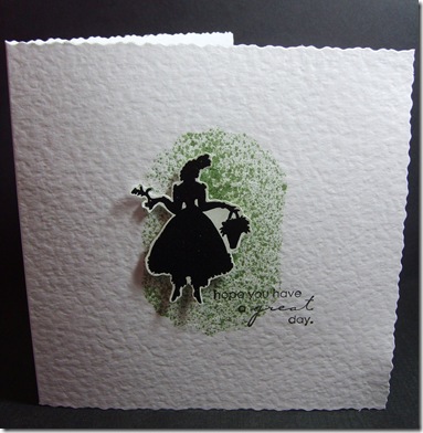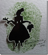
One of the things I love about the blogging world is being able to ask for advice when things aren't quite right with a project. I'm doing this here.... Over at the Play Date Cafe their challenge this week is a Colour Splash – more specifically black & white a splash of GREEN. Green is not really a favourate of mine, and inspiration was lacking so I decided to try another card for this weeks Less is More challenge (pick a square) as the previous one wasn’t quite right (should of left the ribbon off!) and I also wanted something to enter this into the Artistic Stamper Challenge which is ‘Ladies and Girls’. I’m not at all sure about it – I used a stencil and sprayed some Dist ress re-inker mixed with water, onto which I stuck this silhouette, which is from one of the new stamp sets by Stamp Addicts and just added the Penny Black sentiment. The idea worked in my head – not sure it has on paper..or card! Suggestions anyone..??? Esther xx
 ress re-inker mixed with water, onto which I stuck this silhouette, which is from one of the new stamp sets by Stamp Addicts and just added the Penny Black sentiment. The idea worked in my head – not sure it has on paper..or card! Suggestions anyone..??? Esther xx
This is FAB Esther
ReplyDeleteSimple and perfect for our challenge
Thanks so much
Div LIM mandi
Less is More
Stylish and effective I love it... Chris xx
ReplyDeleteVery elegant card
ReplyDeleteBeryl x
loving the C&S style of this card, tis lush! Thanks for playing along with the Artistic Stamper challenge x
ReplyDeleteoh think this is so effective hun think it works perfectly hugs cheryl xx
ReplyDeleteHi Esther, that's lovely, I love silhouettes (and green) - I'm really excited to be on the CRDT with all of you. Maria x
ReplyDeletecute little card Esther x
ReplyDeleteI think this really works. I think the green is perfect :)
ReplyDeleteI love your CAS card! Its perfect!
ReplyDeleteI seldom use green either but this card is just super Esther
ReplyDeleteKathyk
Fabulous card, love the green background, it's my favorite colour.
ReplyDeletexxx Hazel.
Stunning card Esther. Hugs Rita xx
ReplyDeleteI love your card, so arty and elegant all at the same time! A fab entry! Thanks for playing along with us at the Play Date Cafe this week
ReplyDeleteI like it! I love that unique paper! ;)
ReplyDeleteLovely card, like that silhouette.
ReplyDeleteHi Esther, Very pretty card, perhaps your image would be more prominent if you had inked the edges of the mask VERY lightly with the same distress ink(with cut and dry foam) to show the mask shape behind that pretty silhouette? Tell me to get lost but you did ask LOL Have fun, hugs:0) xxx
ReplyDeleteFabulous Esther, I love the silhouette against the green. A lovely shade of green as well.
ReplyDeleteCarole
Honestly esther, I really like this.... perhaps you aren't happy with it because of the texture of the paper? It's a wee bit distracting??? Otherwise I can't see why you're concerned about it!!! Jo x
ReplyDeleteI really like your design and think the green background is a fab setting for your stamp :)
ReplyDeleteJenny x
Well, this is so different and neat! I love the deep texture your paper and edges have. The silhouette is different and elegant. Thanks so much for playing with us at The Cafe this week!
ReplyDeleteActually Esther, I think that the edge of the splatter is a little too defined, if it gradually faded to nothing it would be great, but this a so difficult to achieve in a small space. Maybe if the edge of your mask was a little more randomly shaped it might work... however having said this it's fine as is.
ReplyDeleteShe looks as though she's jumping for joy!
Thanks so much.
Chrissie
Lady LIM
"Less is More"
I love the silhouette...pretty card!
ReplyDeleteMy card is HERE
Your card is super. Caz
ReplyDeleteGorgeous card! Love your image and how you have 'splashed' the green!
ReplyDeleteWhat a neat creative way to use that pop of green. Thanks so much for playing along at The Play Date Cafe.
ReplyDelete